Agency Design
Webflow template
Agency Design
Webflow template
Agency Design
Webflow template
Agency Design
Webflow template
Agency Design
Webflow template
Agency Design
Webflow template
Agency Design
Webflow template
Agency Design
Webflow template
Agency Design
Webflow template
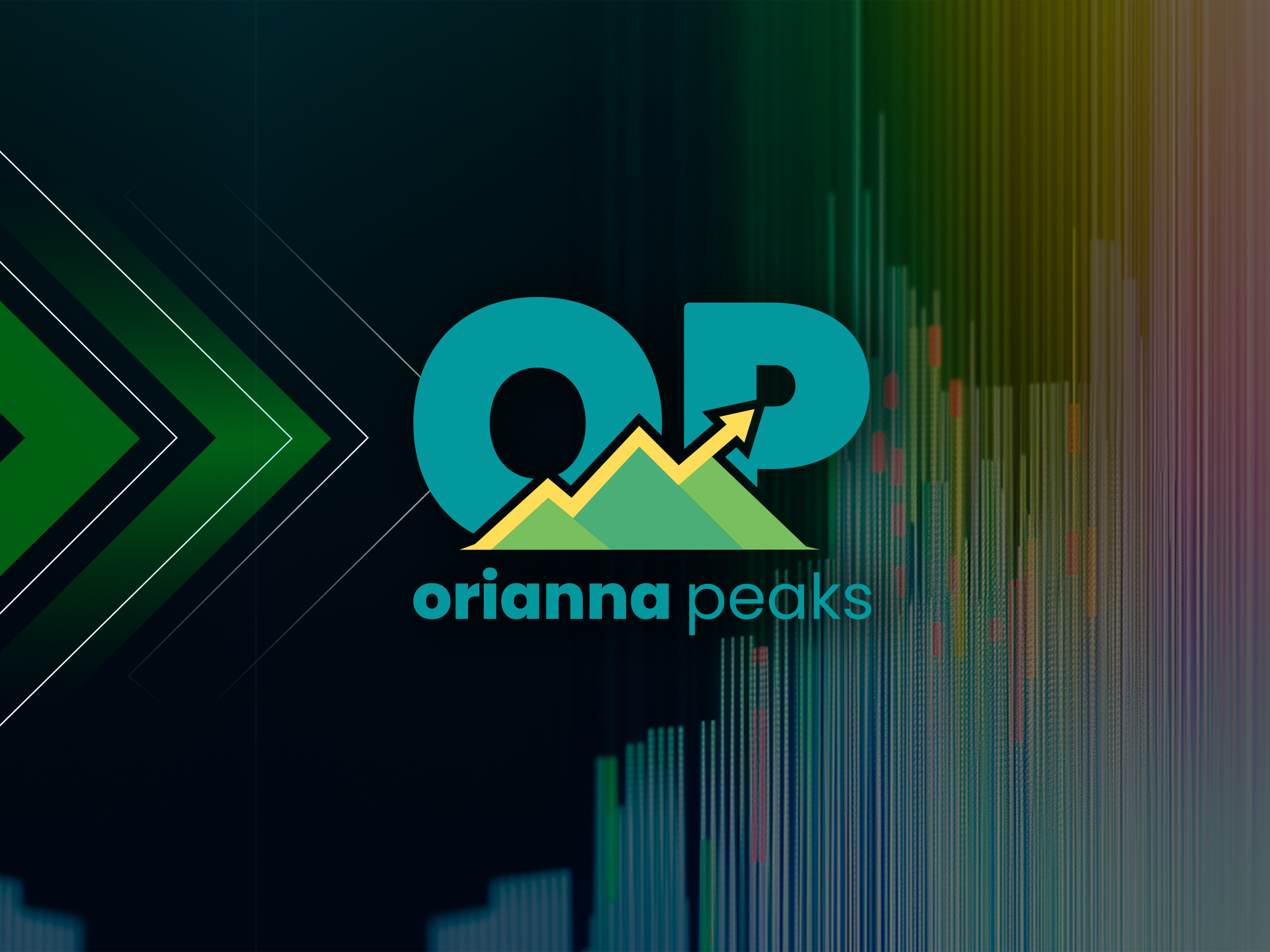
Brand Strategy, Branding
PMB
About the Company
It Takes A Village To Feed One Child (ITAVTFOC) is a 501(c)(3) nonprofit organization founded in 2017 to address food insecurity in Pennsylvania’s most underserved communities. As a state sponsoring organization for the USDA Child and Adult Care Food Program (CACFP), ITAVTFOC distributes more than 150,000 meals each month to children, seniors, and at-risk individuals across five counties. The organization is 100% minority-led and focused on equity, community empowerment, and operational excellence.
The Situation
As ITAVTFOC grew in scale and visibility, its leadership recognized the need to elevate its brand presence to reflect the organization’s credibility and impact. While the team was open to creative exploration, they were deeply committed to their existing logo due to its strong recognition and emotional significance within the communities they serve. The challenge was to enhance usability and consistency without losing authenticity.
The Strategy
We explored updated logo concepts that preserved the heart of ITAVTFOC’s mission while improving scalability, legibility, and adaptability. In parallel, we developed a comprehensive brand guide to establish clear standards for color usage, typography, imagery, and messaging. This approach allowed the organization to strengthen its brand system while honoring its established identity.
The Logo
After reviewing multiple concepts, the client chose to retain the original logo. Our role shifted from redesign to refinement. We made subtle adjustments to spacing, alignment, and file structure to ensure the logo performed well in modern print and digital environments.
To increase flexibility, we created multiple logo variations including seal, square, horizontal, and wordmark formats. The retained mark, depicting a caregiver feeding a child, continues to symbolize compassion, trust, and hands-on service while now functioning more effectively across platforms.
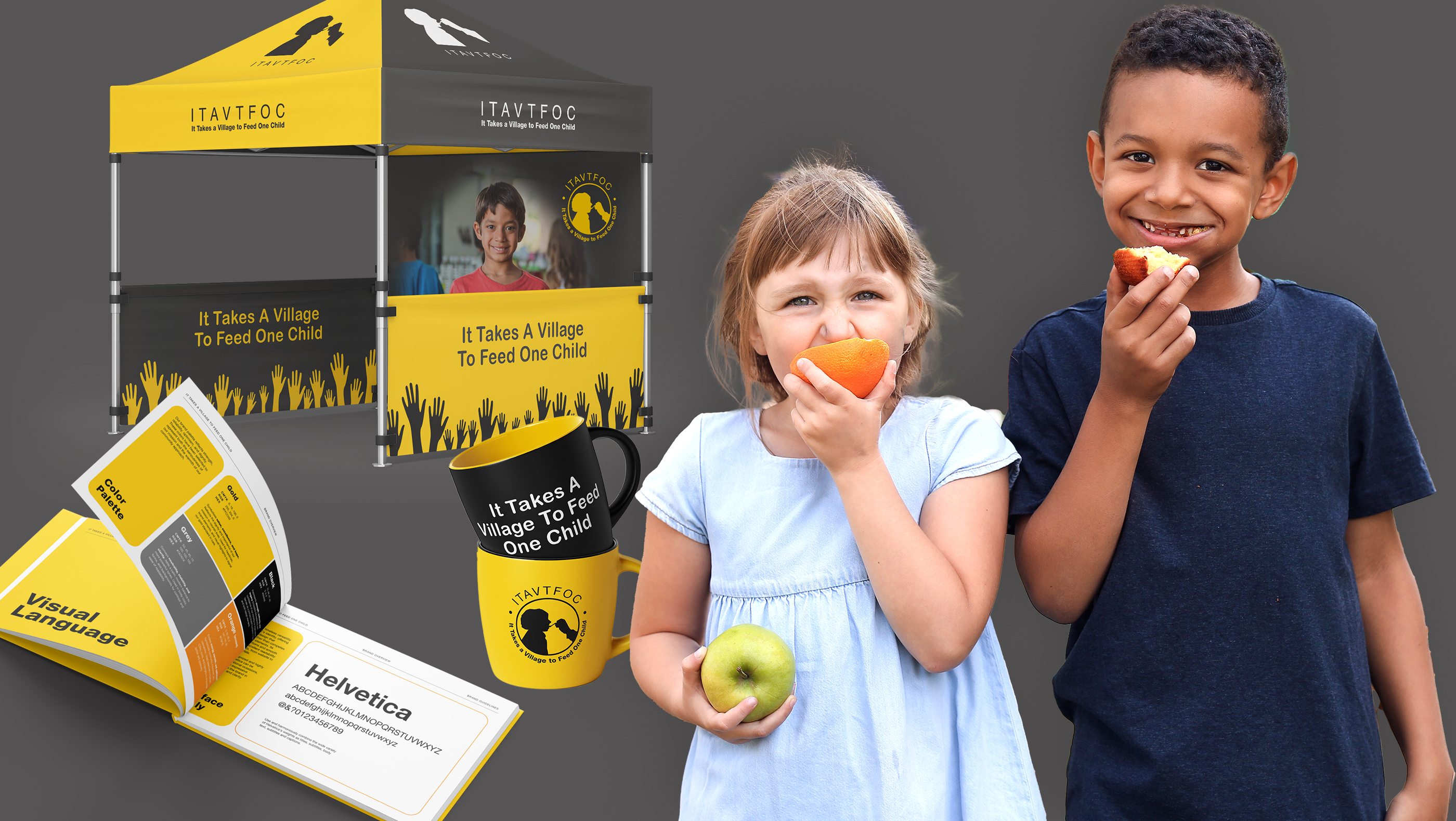
Marketing Collateral
Digital assets were produced to support ITAVTFOC’s online presence, including social media graphics, campaign templates, and a branded video intro for mission-focused content. These assets extend the organization’s voice and visual identity into digital channels while reinforcing its Caregiver brand archetype.Using the refined brand standards, we produced a full range of collateral including brochures, flyers, banners, and apparel. Each piece applied consistent typography, color usage, and logo variants to strengthen recognition and present a unified, professional appearance across community outreach efforts.
Digital Media
Digital assets were developed to support campaigns and online engagement, including social media graphics, reusable templates, and a branded video intro. These assets extended the organization’s visual identity into digital channels while reinforcing its Caregiver brand archetype.
The Website
A modern, mobile-friendly website was designed to serve as ITAVTFOC’s primary digital hub. The site clearly communicates the organization’s mission, impact metrics, and community programs while guiding users toward donations, volunteer opportunities, and partnerships. Responsive design ensures accessibility across all devices.
Positioning for Success
By refining rather than replacing its visual identity, ITAVTFOC preserved the trust it has built within the community while gaining a more flexible and professional brand system. The updated guidelines, expanded logo formats, and cohesive digital and print assets position the organization for continued growth, stronger partnerships, and long-term community impact.